One of the main challenges of analyzing the quality of a website or link prospecting is that you need to make a series of quick decisions regarding the quality of the site you are considering.
Thank you for reading this article.
Don't forget to check our uber mega awesome keyword research and mapping AI tool that is free! (for now...:)
Locating all the right trust indicators can seem like a time-consuming task, but eventually, you’ll get to the point where you will be able to make an assessment of a website in a matter of 7 seconds.
You’ll have to think fast and make sure that your attention is focused on high quality opportunities.

If you need to do this on a larger scale, each second you save on an individual evaluation will really add up in the end.
According to the Missouri University of Science and Technology, when opening a web page, it takes people 2.6 seconds to stop scanning the entire page and actually focus on one element. Once they do, it only takes them 180 milliseconds to form an impression.
These initial impressions are based on your preconceived notions and are practically instinctual in nature, but that doesn’t mean you can’t train yourself to react in the way you should.
For instance, just because a web page doesn’t meet your aesthetic standards, it still might be a great prospect. With practice, you can learn what is and isn’t relevant, where to look, and how to make fast but reliable judgments.
It once took me between 15 and 30 minutes to decide whether I’d try to approach a certain site or not, but now I’m able to do so in a matter of seconds and be certain that I’ve made the right choice in a huge majority of cases.
Here are 7 signs to keep an eye out for to help you judge any website in 7 seconds or less.
Mind the Design
I’ve already briefly touched upon this, but design is still one of the most noticeable aspects of a website and one that’s often misleading. When trying to learn something from the design of a website, your personal taste shouldn’t come into play.
Remember that we are looking for a trust indicator, not something that you will enjoy personally.
You are not trying to assess whether a site is beautiful but instead, whether its layout makes sense, how easy it is to navigate, if its functionality has been compromised for the sake of superficial appeal, etc.
It goes without saying that companies or people who have invested zero time or effort into the design of their site are not too likely to be professional in other aspects of running it, but at the same time, just because a site looks presentable at a glance, it doesn’t necessarily mean it is a viable prospect either.
There is no cut and dry formula for ranking a website according to its design – the only trick is to lay all aestheticism aside, and focus solely on functionality.
 Source: Babich.biz
Navigation bar as a trust indicator
Ever seen a website without an About Us section? Makes you wonder, doesn’t it?

Pages in a site’s main navigation can tell you a lot about it. If you are trying to decide if a site of a particular company is worth outreaching to, you won’t bother with it if they don’t have clearly listed contact information, an About Us section, a presentable homepage.
Knowing how people who are actually using the site behave could help identify the areas you should pay attention to. The Huff Industrial Marketing, KoMarketing, and BuyerZone 2015 B2B Web Usability Report sheds some light on this matter.
The report finds that 47% of first time visitors to a company website will first take a look at the products or services section, 33% will examine the homepage, and 16% will go straight to the about or contact page.
When they land on a homepage, 86% of visitors will expect to see information about the products and services the company offers, 64% will want some contact information, 52% will want to know more about the company, and 27% will be looking for testimonials. Interestingly enough, only 12% will expect to find social media icons, and only 8% will want direct access to a blog.
While none of these stats are carved in stone, if you see that a company is doing their best to satisfy its website’s audience, you can assume they have invested as much effort in other areas of operating their business as well, making them an interesting and valuable prospect.
A lack of contact info isn’t always just an unfortunate oversight, it can also be an indicator that the website owner has no interest in being found on his own asset.
This factor brings up a lot of other questions, but the real question is – do you actually want to have anything with this prospect at all?

My advice is to keep your campaigns focused on legitimate, transparent opportunities. Lack of social proof in navigation should be a reason enough for you to leave that website and never navigate back.
But this is not the only thing that a nav bar can tell you about a website.
If it’s a blog or magazine style site that your are examining, taking a look at the available categories will give you a clear idea of both the topics covered on the site, and their editorial mentality.
For instance, if you see a blog with categories ranging from fashion to technology and marketing, chances are they are only covering these subjects superficially, and might actually be a link farm. It is always more advisable to reach out to a site which specializes in only one particular subject matter, and which carries much more authority within the industry.
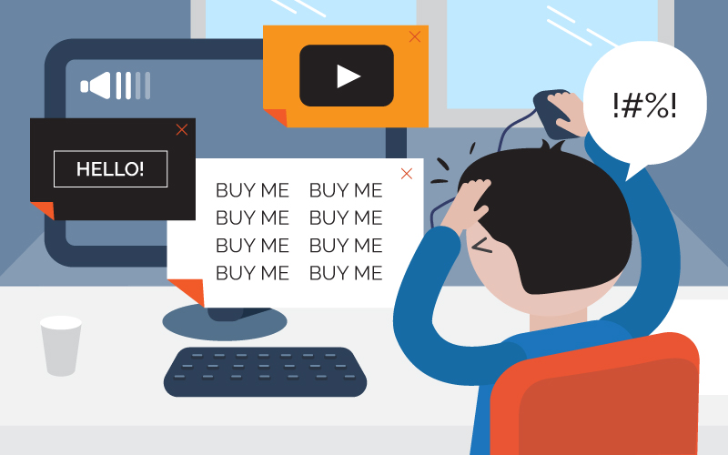
Adding up the ads
Vilified since the very beginning, ads are a necessity for a lot of websites, i.e. their only or primary way of making money, but people can still be very easily deterred by them.
Google has, for a long time now, been treating too many ads above the fold as an indication that the site in question may not be of the highest quality, but they are perfectly aware of the fact that people need them, and that the number of available ads shouldn’t be fixed, but indeed, dependent on the amount of content around them.
So, what do you need to do (once you have made sure that your AdBlock is off) when you want to find some prospects?
First of all, numbers are still an issue, and while I can’t give you an exact figure, I can say that if the ads seem to dominate the content, you might want to skip that particular website.
Of course, the nature of the ads will also influence your decision. Apart from the obvious offenders, such as porn or gambling, you should also be wary of websites advertising products or services that have nothing to do with the subject matter they tend to focus on. To put it simply: a pet related website advertising dog food is A-OK, while a pet related website advertising cosmetic treatments is best avoided.
Finally, if the site you’re inspecting decides to surprise you with a pop-up ad, you might be irritated, but it still doesn’t mean they are not potentially interesting for outreach. While they are annoying, pop-ups offering newsletter subscription or some other resource native to the site have become quite common, and shouldn’t immediately turn you away.
If, however, a site interrupts your experience just to inform you that So-and-so is still selling the cheapest this-and that, give them a wide berth – they don’t deserve yours or anyone else’s attention.
How social are the social media channels
A site is nothing without an audience, so giving social media profiles a once-over is definitely advisable. Most responsible and capable webmasters will ensure that the site’s social accounts are easily available, and that all content comes with ready-made buttons for easy sharing.
Again, you’ll need to rely on your experience when making any judgement. It’s easy to buy likes or retweets, so you can’t just take a fast look at the numbers and decide the site is popular.

Likewise, if you notice that a finance website has a Pinterest profile, you might want to give them a closer look. In turn, if a site only has a profile on a single social network, don’t write them off just yet. Maybe they have found a way to the hearts of their followers, and know exactly how to reach them.
The more actual engagement from relevant audiences on social networks, the more value you’d get from associating with the site. Make sure you also give it a like, a follow, or a retweet, just to let them know you have stopped by.
The flashiness of flash content
Flash has been abandoned by just about everyone except the loudest proponents of the theory that we should stick with something that is full of security and stability issues; drops page performance; and is used to frighten the visitors with different video pop-ups.
Webmasters sticking to it may not take optimization too seriously, and are perhaps not particularly active when it comes to updates and maintenance. Naturally, its presence shouldn’t make you ignore an otherwise perfectly optimized website, but it is still a red flag.

The need for speed
While an exact number depends on the type of website, and consequently, user expectations, people usually don’t wait more than a few seconds before they leave a page that takes too long to load. Not only is this a direct negative signal when it comes to search engine rankings; it increases bounce rates (another direct signal); makes you lose potential customers or readers; and is by now almost considered bad etiquette.
Sites where page loading speed is secondary to flashy graphics or other bulky page elements that don’t add real value are probably best avoided. If the site doesn’t suffer from this issue but still lags, it might have been made by someone who‘s not all that proficient in web design, which can cause a whole range of problems.
When assessing a website, I try to pay attention to the same things that a crawler or visitor would, and page speed is valued by both.
In simple terms – if it isn’t fast it isn’t that good!

Date of latest post (have run out of puns by now)
One of the more general pieces of advice I can give you is to try and find ways to disqualify a site as a prospect before even starting to consider its qualities.
What I mean is that there may be a hundred things recommending a site, but if you find one that makes it unsuitable for outreach, it’s infinitely better to find it right away than to first spend half an hour considering the site’s speed, content quality, social media following, etc.
Before proceeding with any kind of further analysis, make sure that the site you’re planning to examine is still active. Sounds like a no-brainer, but everyone who has dealt with prospecting knows how easy it is to get carried away when you come across something you like.
However, if there is no one home, you probably shouldn’t come around knocking on the door. Unless you’re insane.

Blogs often feature new articles on their homepage or have an archive you can easily access; directories have a latest entries section; forums display the most recent posts; etc.
If this is too disorganized for you, always try using the site: operator with the search set to only return results from the previous month or week, but even this could give you false negatives at times.
Tying it all up in a festive ribbon
However, even though you can notice most of these issues at a glance (along with other potential signals, like the length of the URL, number of hyphens in it, external links in the main navigation, etc.) there are less obvious indicators that a site might be wrong for you. This includes cloaked links, spammy anchors leading to the site, Domain Authority, and so on.
Knowing how long it might take to check each trust indicator individually, we’ve equipped Dibz with a Spam Filter that takes everything I’ve mentioned into account, assigns a numerical value to it, and based on that value, either shows the site in search results, or chooses to omit it.
Depending on your authorization levels, you can tweak the filter settings to better accommodate your needs – getting more results that require more scrutiny, or getting less, but being practically sure that they will all meet your standards.
If you want to see this in action and save yourself quite a bit of time, give Dibz a go, and let us know how your latest prospecting endeavors are going!